 Each week, I feature someone’s watchscreen, highlighting how they’re using it, apps they like, how they view the product, and tips and tricks they’ve discovered. This week, I’m excited to feature Andy Faust (Twitter), a tech enthusiast and blogger at watchaware.com (a site you really ought to follow). Andy has written well-considered pieces on Apple Watch; I don’t always agree with them, but they’re always insightful and stimulating! So, Andy, show us your watchscreen!
What watch/band combination do you have? Why did you choose it?
 I bought the 42mm Space Black Sport with the black Sport Band. I actually prefer the aluminum/Ion-X matte build to the DLC stainless model (both aesthetically and for impact durability reasons), and the $800 savings is nice, too. As I’ve written before, I think the Sport Band is the biggest, most impactful design triumph of Apple Watch, and that’s all Marc Newson (which bodes well for the Jony Ive-less future of Apple in general). The thing is a pleasure to put on and take off, and it’s remarkably comfortable.
How is Apple Watch fitting into your life?
Seamlessly as a watch, but not very well as a mobile assistant. It will take a while (and an open SDK, which was just announced last week). I do enjoy the added security it offers as a Life Alert-type of emergency device, though. And that’s offered great peace of mind from day one. I also find it useful for things like quickly setting timers and alarms (provided you word your Siri requests correctly).
What watch faces & complications are you using and why?
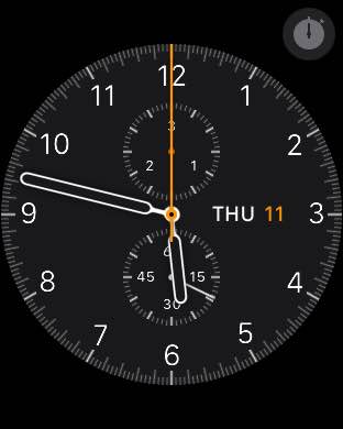 I use Chronograph, Simple, and Utility, all begrudgingly. I’ve turned off all Complications. They’re not useful to me as they are now, and frankly, I’m just as fed up with the face options themselves. Without third-party faces, I don’t see myself upgrading to the next generation unless it has something radical on-board, like deep health monitoring (think optical glucometer, blood pressure trend metering, arrhythmia detection, sleep apnea tracking, etc.). Even as watchOS 2 provides for third-party complications, that’s probably not enough to change my mind on those, and they’re not really a big deal to me anyways. But third-party Faces are a must. I think we — and most users — agree on this. [Andy wrote a good piece on 3rd party watch faces. I’ve written about this before as I agree with him.]
What Glances do you use and why?
As few as possible, truthfully. I am disappointed with Glances (perhaps even conceptually) so far. Settings, Heart Rate, Dark Sky, and the Music remote are the only Glances I have enabled right now. Even after Apple Watch comes into its own, I doubt I’ll ever reach its 20 Glance limit — even after the apps are better and that limit is lifted.
What’s your strategy for getting the right notifications on Apple Watch?
Trial and error, then frustration and acceptance. Notifications are unreliable and forward erratically. I often put my iPhone into my pocket and receive a notification–to that iPhone–within a few seconds of locking its screen and going back about my business. Sometimes, I’ll toss my unlocked iPhone onto my bed as I wander away from my room for a moment, only to have notifications come dinging in some 50 feet away from where I currently stand. My Apple Watch, meanwhile, won’t register such incoming notices in those brief windows of lock and/or separation, and I’ve got to either pull my handset out–or rush back to my bedroom–to see what’s what. There should be absolutely zero buffer here as far as I’m concerned. [Agreed, though I’ve never experienced this or heard anyone else complain. Has this been your experience? Leave feedback in the comments]
Additionally, the amount of time you’re able to actually check a notification in a “hands-free” manner is much too short. Sometimes, I might need to finish writing a sentence–like this one–before I’m ready to glance at my wrist. A 10-15 second window would be plenty adequate, but the time allotted right now is almost uselessly short. I miss the majority of notifications I receive, at least when it comes to their automatic presentation. To say this is annoying is a massive understatement. [Absolutely agree with this; it was one item I wrote about as a necessary step in allowing Apple Watch’s functions to follow its form]
How are you using Apple Watch’s health and fitness features?
Right now, I’m not. But I intend to use the fitness suite soon. A few health and family hiccups have to be ironed out first. I’m almost there. Hopefully, I’ll be able to document my progress on the site once it starts. Back in 2008, I stuck to a cardio regimen and lost 80 pounds in four months. I attribute my success and stick-to-itiveness back then primarily to the quantification (now popularly reclassified as “gamification”) that my Polar watch and chest strap provided during that run (or rather, those runs).
How are you using Apple Watch’s communication features?
Sparingly. Siri is a bigger disappointment than ever for me and my very mild southern accent, and it’s almost impossible to compose cogent messages. If I can’t respond with a canned comeback, then I’ve got to send a voice recording or dig into my pocket. Fixing dictation mistakes is a huge hurdle, too. Lots of “do-overs.” I’m over them.
How do you organize your apps and why?
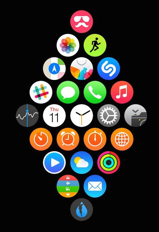 I don’t anymore. I’ve tried, but the dynamically reactive honeycomb structure makes desired app placement a major pain, and I don’t use the launch interface enough to justify dealing with it. If I could have three columns (straight up and down with no offset), that’s likely what I’d choose. The constellation is nice to look at, but it’s slow to use and even slower to set up for optimal efficiency. I’ve tried to logically sort my stuff as I do on iPhone, but everything keeps “snapping” out of place each time I attempt to make up a suitable grid. The honeycomb design, to me, is a clear example of form over function, of which I see many in the first-generation Apple Watch. I’m just not much into the circles and the horological homages in the UI.
Outside of Faces, this is a very square device, and squared elements, including app icons, would suit it better. We all agree that a circular smartwatch display wastes valuable pixel real estate, but circular elements on a square display do largely the same thing. You can’t square the circle. Similarly, you can’t circle the square.
What Apple Watch apps are you using most and why?
Messages, Phone, and Maps. There are very few compelling third-party apps right now. Dark Sky and Buy Me A Pie! are about all I use, and that’s because of South Florida and GERD, respectively. Soon, I’ll hopefully be able to add Apple’s fitness suite to that list. With watchOS 2, however, this meager selection will surely change. I’m even putting together an app of my own, which — if it ever actually materializes — will be greatly useful for me and likeminded hobbyists. It will certainly not be a money-making endeavor, but that’s not important to me and my partners/sponsors.
[Other 3rd-party apps on Andy’s screen are Slack, Shazam, and Poll Party!]
What apps do you think best leverage the uniqueness of Apple Watch? Why?
Not including fist-party staples like Messages, I haven’t seen any yet. Again, with all the limitations right now, Dark Sky and Buy Me A Pie! come closest for me. But why? For Dark Sky, there’s no good reason save for its notification-like, lightweight, glanceable presentation. For Buy Me A Pie!, it’s because I hate — hate! — using my iPhone for grocery shopping. Being able to look down at my wrist with my hand on the cart saves me from a lot of stop-and-go aisle to aisle. I’d liken it to using Apple Watch for navigation while driving.
[Interestingly, Dark Sky has been mentioned in every single watchscreen piece so far. Those guys are doing something right!]
What app would you like that you don’t have yet?
The one I’m working on. That’s pretty much why I bought my Apple Watch in the first place, and it’s why I cared about the device’s potential long before that. But if we’re talking about apps from others, it’s hard to say. I think the best apps that everyone will look back on and recognize as groundbreaking, platform-defining must-haves aren’t out yet (even as limited 1.0 versions), and I don’t think they’re going to be largely attached to brands or services we’re already familiar with. Many will come from known developers, but this is an opportunity for a whole new breed of app-maker to get a foot in the door. The simple reality is that most existing iOS apps don’t translate well to the wrist.
If you could change only one thing about Apple Watch, what would you change?
I’d get rid of the Digital Crown and move the “friends” button to a fully ambidextrous, centered orientation. (I guess that’s technically two changes.) This button would then be enabled with a touch sensor surface, replicating and enhancing (via inertial scrolling and hold-to-scroll edge zones) the main function of the delicate wheel while eliminating a significant moving part from the manufactory and durability equations.
The Digital Crown is another symbolic, form-over-function inclusion designed to attract the fashion set by allowing Apple Watch to shed the longstanding smartwatch “geek” stigma, and its days are thus numbered as the wearable becomes mainstream. The Digital Crown is very well done, but it’s also very unnecessary for future revisions. (An alternative to my proposal is to embed an inertial touch sensor into the curved, off-screen bezel on one side, keeping the single friends button a strictly depressible module.)
All that said, I’m high on Apple Watch’s potential. I don’t think it will ever replace iPhone or become any meaningful segment’s primary computing platform, but that’s not the point. As Mark has written many times before, Apple’s overarching strategy is all about its ecosystem. Overall, Apple Watch is a tremendous device with an astronomical upside, and I’m glad to be a part of the thing’s first days.
Thanks Andy (Twitter)! If you enjoyed this, check out his blogs at WatchAware!
Check back next week for another watchscreen or look now at previous watchscreens. You can subscribe to this site via RSS, Tumblr or by following MarkDMill on Twitter.
If you enjoyed this, you might also want to check out the weekly reviews of Apple Watch I’ve done:

One thought on “Watchscreen: Andy Faust, blogger at WatchAware”